Building a Link Preview
A link that previews where it goes, follows your cursor, and stays alive as you move between links.
What is a Link Preview?
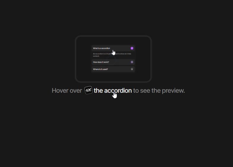
A link preview is a link that shows a small picture of where it goes when you hover it. You have seen it on Wikipedia and Notion.
Hover over  the accordion to see the preview.
Mine does two extra things. The preview follows your cursor sideways. And when you move from one link to the next, it does not close and open again — it slides across.
There is one panel for the whole paragraph. Each link only reports "I am hovered, here is my box and my image." The panel does the rest.
// LinkPreviewGroup.tsx
export type PreviewTarget = {
  previewType: 'image' | 'video'
  previewURL: string
  rect: DOMRect
}
Positioning
The link measures itself with getBoundingClientRect().
// LinkPreview.tsx
const rect = anchorRef.current?.getBoundingClientRect()
This gives a box in viewport coordinates — measured from the top-left of the window. The panel is position: fixed, which uses the same coordinates. So there is nothing to convert. Every number in this component is a viewport number.
The panel is also portalled to document.body. A div inside a p is not valid HTML, and a portal means no parent with overflow: hidden can clip it.
Edge detection
The panel is 208px wide. Hover a link near the right edge and half of it would be off screen. So the panel's centre is clamped to the window, with a little padding.
// LinkPreviewGroup.tsx
const half = PANEL_WIDTH / 2
const min = EDGE_PADDING + half
const max = window.innerWidth - EDGE_PADDING - half
const centerX = clamp(pointerX, min, max)

return { x: centerX - half }
Clamp against window.innerWidth, not against the link. The link only tells you where the link is. The window tells you where the screen ends.
Vertical is the same problem. A link near the top has no room above it.
// LinkPreviewGroup.tsx
const roomAbove = rect.top - EDGE_PADDING
const roomBelow = window.innerHeight - rect.bottom - EDGE_PADDING
const above = roomAbove >= PANEL_HEIGHT + GAP || roomAbove >= roomBelow
Stay above if it fits. If not, go below — unless below has even less room. Then stay above anyway.
When the panel flips, three things flip with it:
| above the link | below the link | |
|---|---|---|
| position | rect.top - GAP - PANEL_HEIGHT | rect.bottom + GAP |
transform-origin | origin-bottom | origin-top |
| entry direction | grows up | grows down |
If you move the panel below but leave the origin at the bottom, it scales away from the link. A popover should always grow out of the thing that opened it.
Following the cursor
Two motion values. x is where the panel should be. springX is what is actually rendered.
// LinkPreviewGroup.tsx
const x = useMotionValue(0)
const springX = useSpring(x, { stiffness: 350, damping: 32, mass: 0.6 })
On every mouse move, the link sends its cursor position, and the group sets x.
// LinkPreviewGroup.tsx
move(px) {
  pointerX.current = px
  if (!isOpen.current || reduceMotion || !activeRect.current) return
  x.set(positionFor(activeRect.current, px).x)
}
The spring trails the cursor by a few frames. damping: 32 means no overshoot — the panel should feel attached to your pointer, not bouncing around it.
The vertical spring is stiffer (450). It only moves when the link is on a different line, and that should feel like a snap.
With prefers-reduced-motion, the panel skips the spring and sits centred over the link. It still fades in, because the fade is what tells you something appeared.
Hover and rest
If every link opened the moment you touched it, sweeping across a paragraph would flash nine previews. So the group uses two timers, the same way tooltips do.
- delay — you must rest on a link for 400ms before the first preview opens.
- skip delay — after the panel closes, the group stays "warm" for 400ms. Hover another link in that window and it opens at once.
// LinkPreviewGroup.tsx
open(next, px, immediate = false) {
  pointerX.current = px
  clear(closeTimer)
  clear(coolTimer)
  clear(openTimer)

  if (warm.current || immediate) {
    apply(next)
    return
  }
  openTimer.current = setTimeout(() => apply(next), delay)
}
You pay the wait once. After that the whole paragraph feels instant.
This has to be a setTimeout, not a transition={{ delay }}. A transition delay only delays the animation. The state would still flip, the position would still be set, the video would still start playing. Hover intent has to delay the decision to open.
warm, isOpen and the timers are all refs. They change on every hover, and if they were state the whole paragraph would re-render each time the cursor crossed a link.
Moving between links
Three small things let the panel survive the move from link A to link B.
1. Closing is delayed. Leaving a link schedules a close instead of closing.
// LinkPreviewGroup.tsx
closeTimer.current = setTimeout(() => {
  setOpen(false)
  isOpen.current = false
}, closeDelay)
2. Opening cancels a close in flight. Entering link B calls open, and the first line of open is clear(closeTimer). The close from link A never fires, so open never becomes false, so nothing fades out.
3. Appearing and moving are different.
// LinkPreviewGroup.tsx
if (isOpen.current) {
  // already visible — slide across to the new link
  x.set(pos.x)
  y.set(pos.y)
} else {
  // appearing — start in place instead of flying in
  x.jump(pos.x)
  y.jump(pos.y)
  springX.jump(pos.x)
  springY.jump(pos.y)
}
Without jump, a fresh panel would fly in from wherever the last one closed. jump teleports the spring instead of animating it.
The image inside crossfades with AnimatePresence, keyed on the URL. Both layers are absolute inset-0, so they overlap instead of pushing each other.
What I learned
getBoundingClientRect()andposition: fixedshare a coordinate space. Stay in it.- Clamp against the window, not the trigger.
- When the panel flips side, the origin and entry direction flip with it.
- Nine previews became one panel, and the component got smaller, not bigger.